Sequestered
A NEW DIRECTION or: how I stopped TEXTING and learned to love the SPRITE
A WHOLE LOTTA LESSONS LEARNED
At the very beginning of this project, this game's working title was "Another Sad Chronicle Involving Icons". The basis of the game's art direction was initially to create every character in the game out of Unicode characters from Windows system default fonts, and then to use a hand-picked commercial use font for the UI. Decided to not JUST use fonts for the environments and characters however, so a re-brand was put into effect. A good thing I did this early on too because...
LESSON 1: PLAN AHEAD OR END A DEAD HEAD
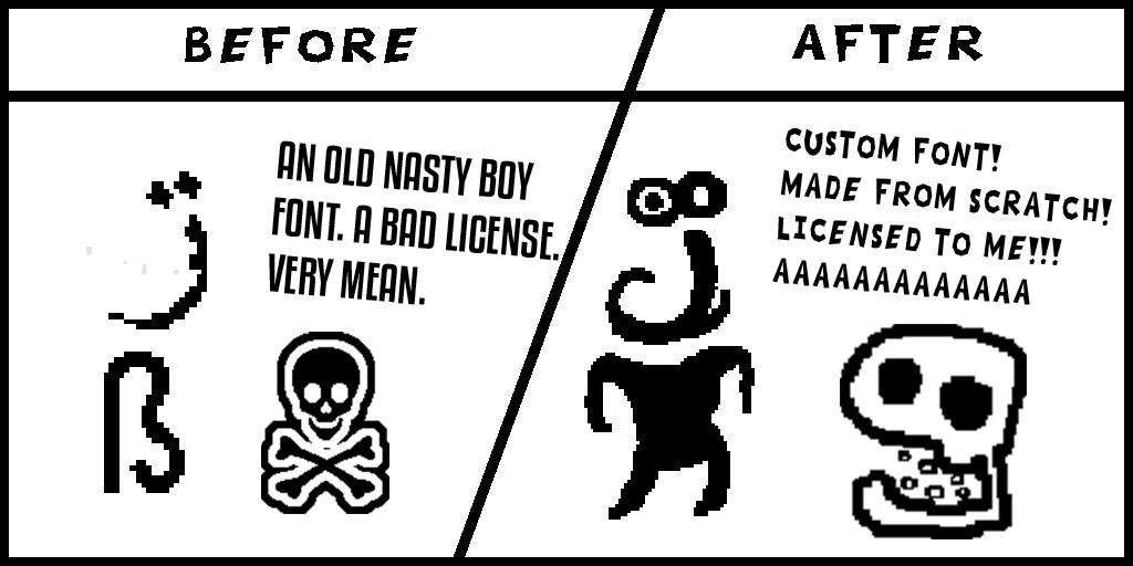
In a moment of worry, and about 20 sprites in, I decided to actually look into the true licensing of system default fonts. Lo and behold, can't be using them for games without a license! Didn't really want to be spending £800 or risking any legal troubles down the road, so all my lovely Wingdings and Webdings monsters and UI elements were immediately scrapped and redrawn.
NO BIG DEAL YEAH I'm not artist but this game is my heart and soul and in the end I want it to be something only I can make - a unique vision. NO BIG DEAL YEAH. We can move past it. Surely no other fonts will cause me any issues?
LESSON 2: "FREE FOR COMMERCIAL USE" IS THIN ICE AND I'M ALREADY COLD
A week passes and I get nervous about my UI font even though it was defined as commercial use. This one is totally my fault once again. Should've read the license properly. Use on graphics and print etc? Totally fine! Free for commercial use! Embedded into software however NOPE BRO, GOTTA PAY £80. Honestly not a huge amount of money but, I really didn't want to foot that bill. I'm sat there, foot in mouth, feeling like a complete goon. A clod. A fool. A maroon.
LESSON 3: OPEN-SOURCE AND CC0 ARE FRIENDS. LOVELY SOFT FRIENDS
So I made my own font! Turns out there's a FANTASTIC open-source piece of software known as FontForge, and I seriously can't recommend it if you ever want your own font for a project. It took quite a few hours, but I came out on the other end with a font that I think really blends with Sequestered's new visual identity. I also triple QUADRUPLE checked all my helpful public domain assets, and found absolutely no licensing issues that should trip me up. Will this remain a fact for long? STAY TUNED
LESSON 4: EFFORTFUL ART ALWAYS SMACKS DOWN ON MY LAZYFUL ART
In not even a few minutes of effort, the new designs (Inspired heavily by my original text designs!) were brimming with so much more personality, and matched the tone of the game so much more. In retrospect, seeing WACKY AND ODD dialogue coming from a dude that's basically two letters smacked together isn't as fitting as a weird dude with an actual /design/ to him.
In the end, the project may be in its super early stages, but as the guy who's spent a couple hundred hours with the project this year alone, it feels like with every bump in the road I hit that requires a COMPLETELY new approach, the project actually comes closer to the cohesive vision and design that I've truly wanted to represent all this time, and I am so excited about where things are going.
THOSE WERE THE LESSONS LEARNED. THANK YOU FOR READING :) :) :): ):) :) :) :O
Sequestered
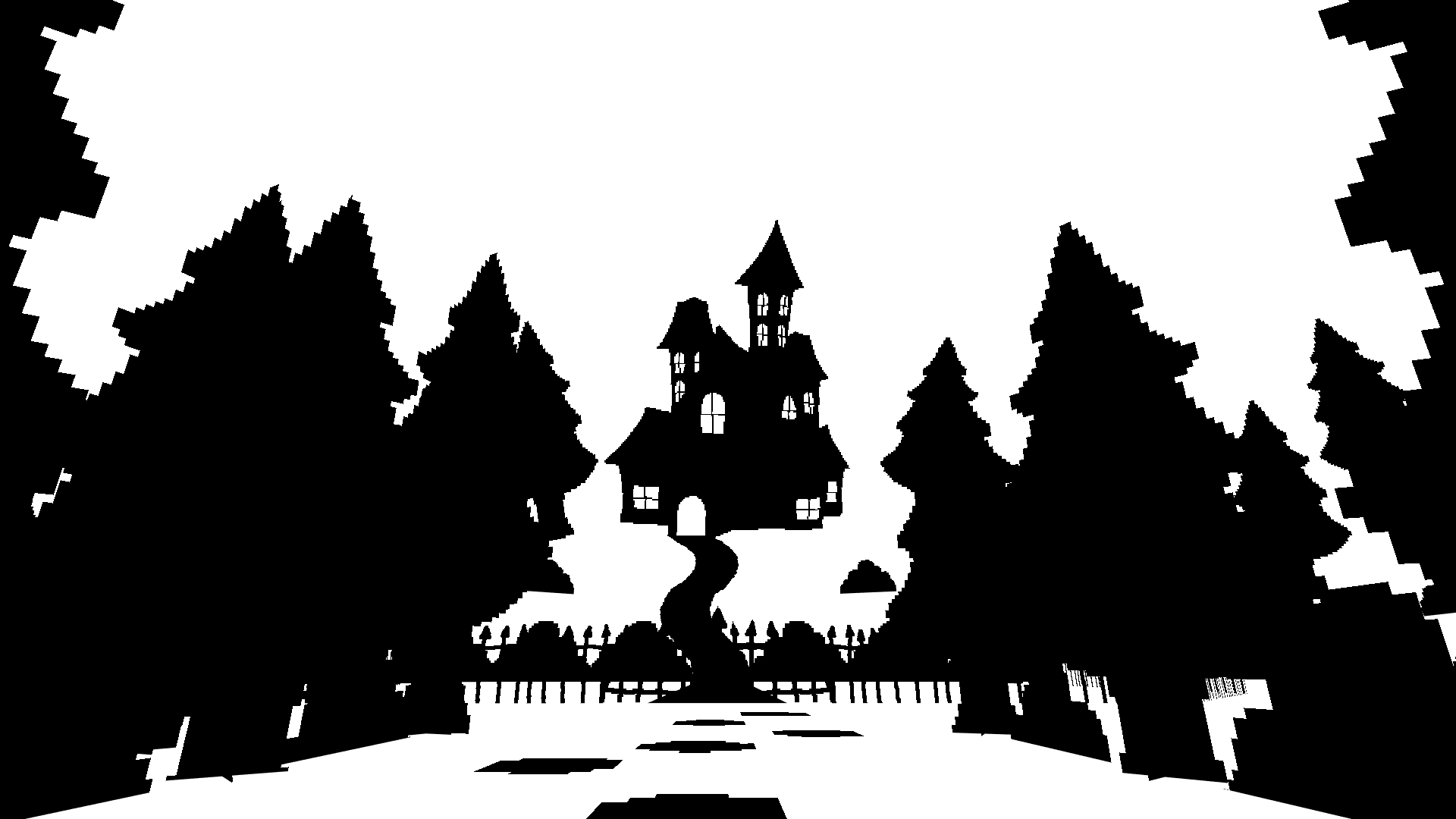
Black & White Blobber Boomer Mover Shooter JRPG
| Status | On hold |
| Author | Caladrius |
| Genre | Role Playing |
| Tags | artgame, Creepy, Experimental, JRPG, mind-bending, Movement Shooter, Surreal, weird |
| Languages | English |
| Accessibility | Color-blind friendly, Subtitles, Configurable controls, High-contrast |
More posts
- Vertical Slice IncomingFeb 12, 2025
- Sequestered: A History of Inexperience & Thumb TwiddlingJan 29, 2025
- SEQUESTERED will be at the EGX Rezzed Leftfield Collection!Feb 16, 2020
- BACK in BLACK (and white)Jan 16, 2020
- THE START OF THE RUINATIONMar 16, 2019
Leave a comment
Log in with itch.io to leave a comment.